Property values and the wildland urban interface
Most consequences of climate change will be felt most severely by the least wealthy and most vulnerable populations in the world. However, this may not be true of every effect of climate change.
In 2017, devastating wildfires in Northern and Southern California captured headlines across the US for weeks. Many of these stories accurately described how climate change was causing shifting weather patterns that would make the frequency and severity of such firestorms more likely.
Homes in California are extremely expensive, and as a renter, I was curious about the average wealth of the impacted population in the Southern California wildfires vs. the overall population.
The first thing that I tried to create was a map of wealth, or net worth. This can be very different from income, which is often conflated with wealth! Mapping true wealth is quite hard to do. The American Community Survey does not collect this information, and I was unable to find any other geographically precise data source. However, the ACS does collect information on housing, and since real estate is one of the biggest sources of embodied wealth, I decided to look at that data.
This is a map of median home price multiplied by percent owner occupancy in California. This isn’t 100% accurate, because home price and owner occupancy are not uncorrelated variables. However, it was good enough with the data that I had available.
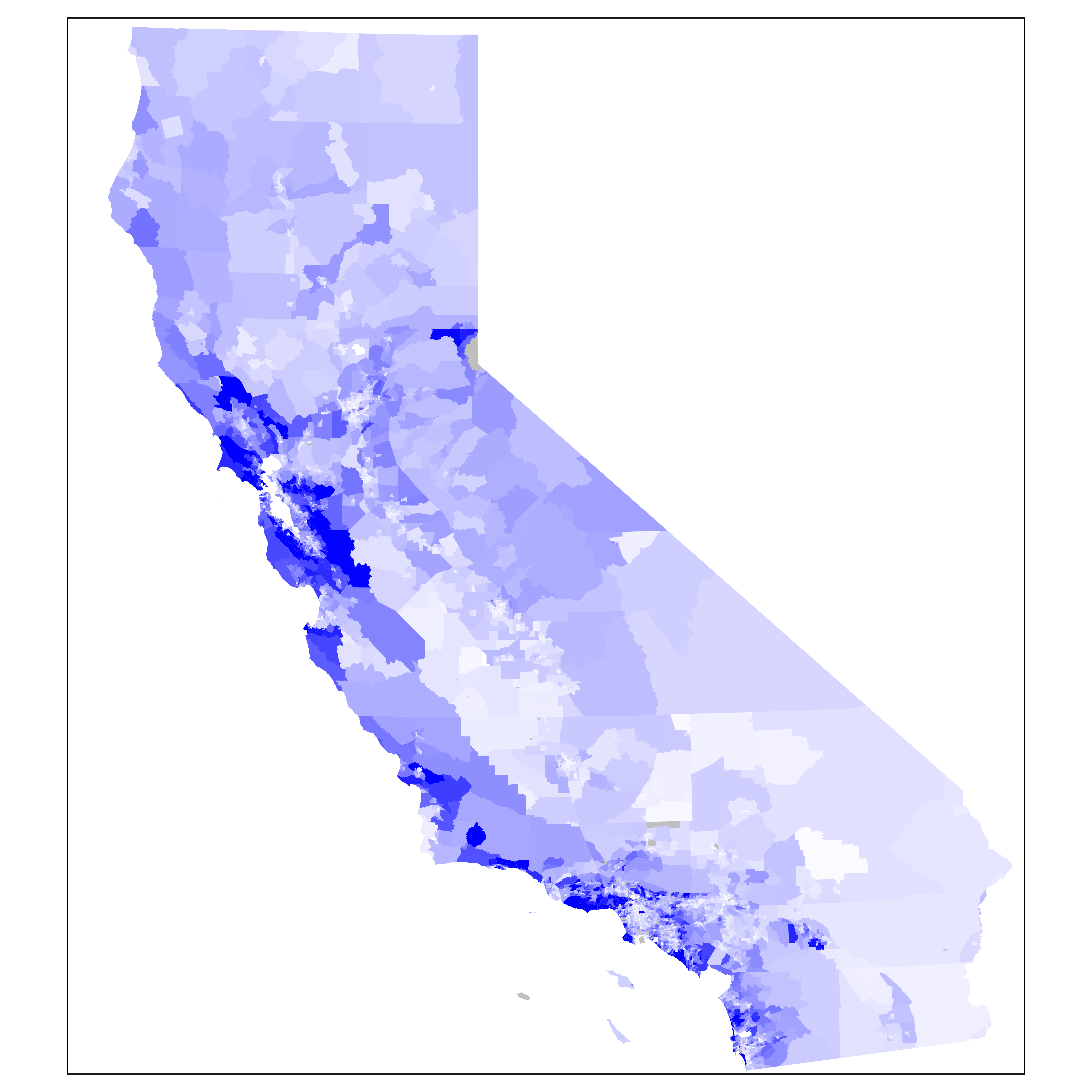
Notice that this is pretty different from a map of income, or a map of home values. The cores of cities are mostly light blue, not because people there are low-income or real estate is low value, but because owner occupancy rates are low. A notable exception to this in the Bay Area is the west side of San Francisco.
I can also plot all three variables, income, property values, and embodied real estate wealth, as RGB values on a single map.
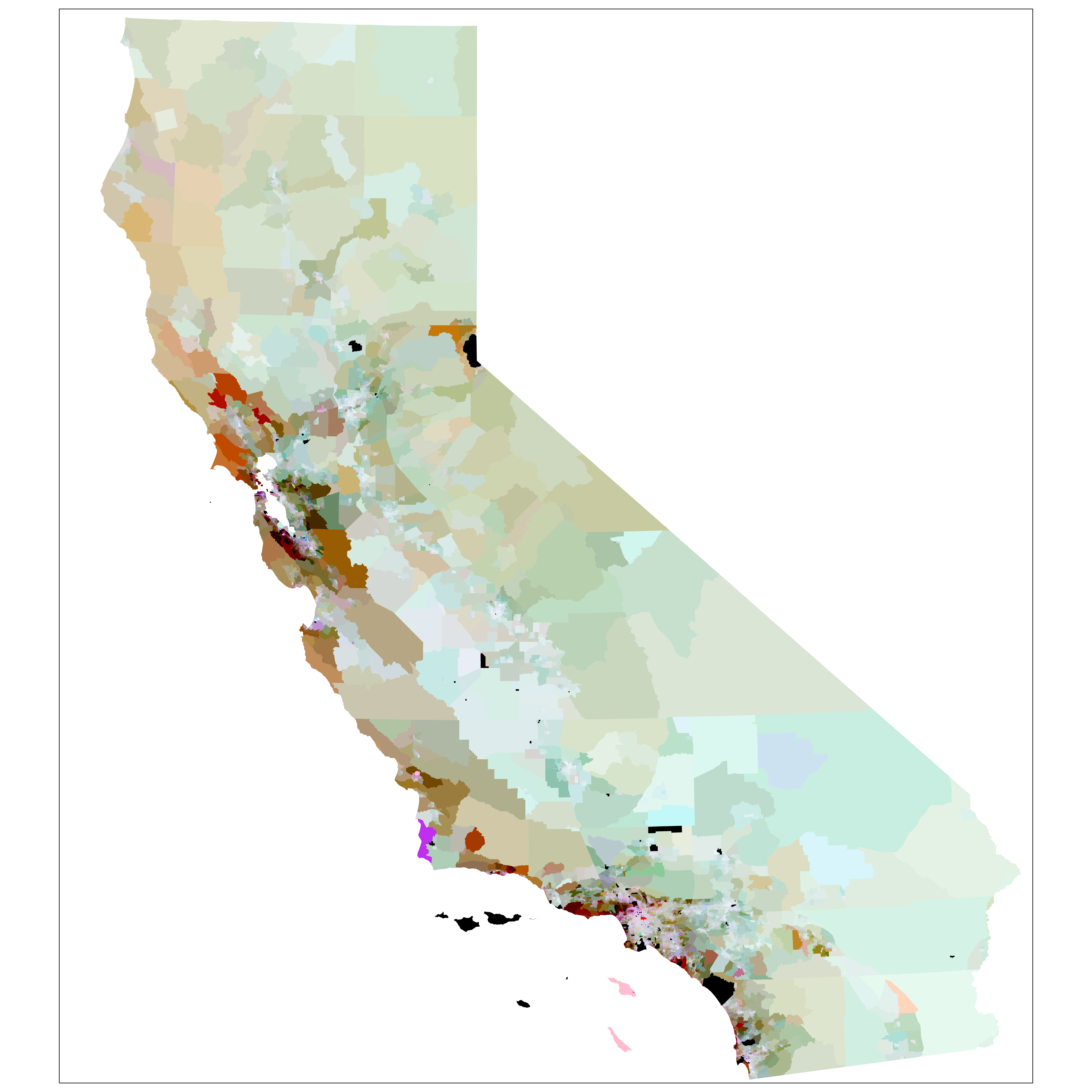
This is kind of ugly and definitely difficult to interpret.
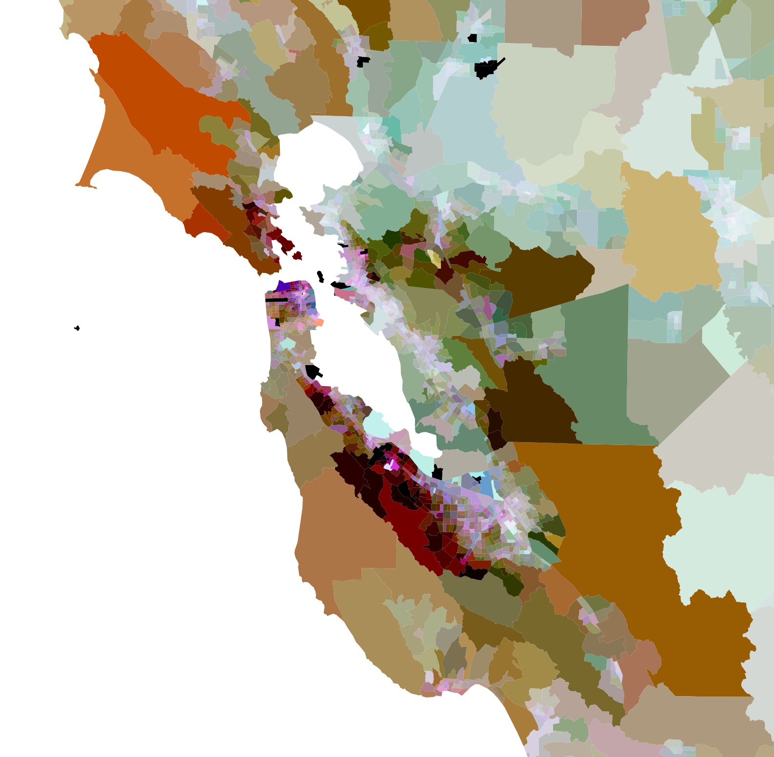
 The Bay Area shows distinct regions: high income urban cores and low income inner ring suburbs both share low real estate wealth, while low income rural exurbs benefit from very high property values and rates of home ownership.
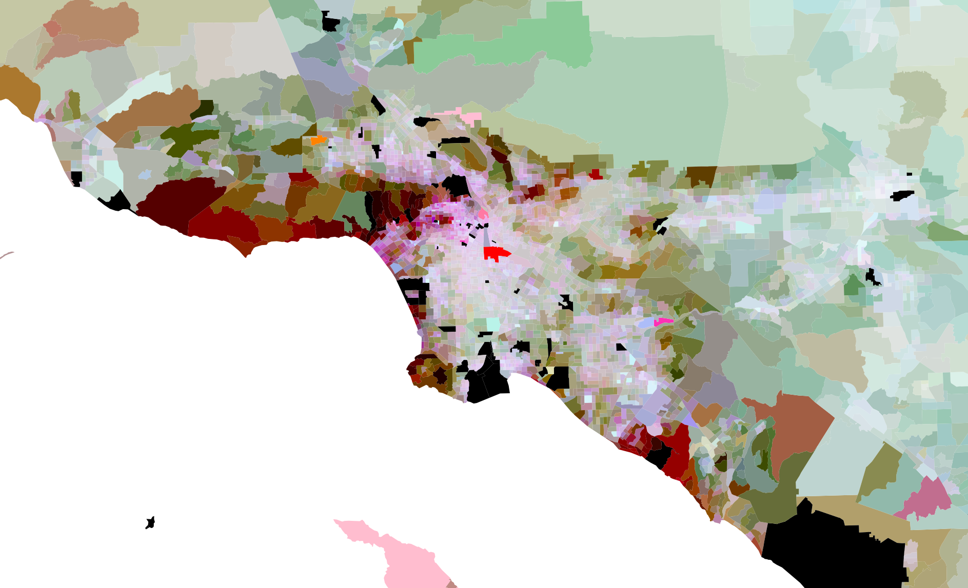
In LA, similar patterns are visible, but with much less rural property wealth.
Next, I took a shapefile of the wildland-urban interface — the vulnerable part of a metro area where development has encroached on the forest and mountains around it — and plotted it on top of the real estate wealth data. From urban conurbation to urban conflagration.
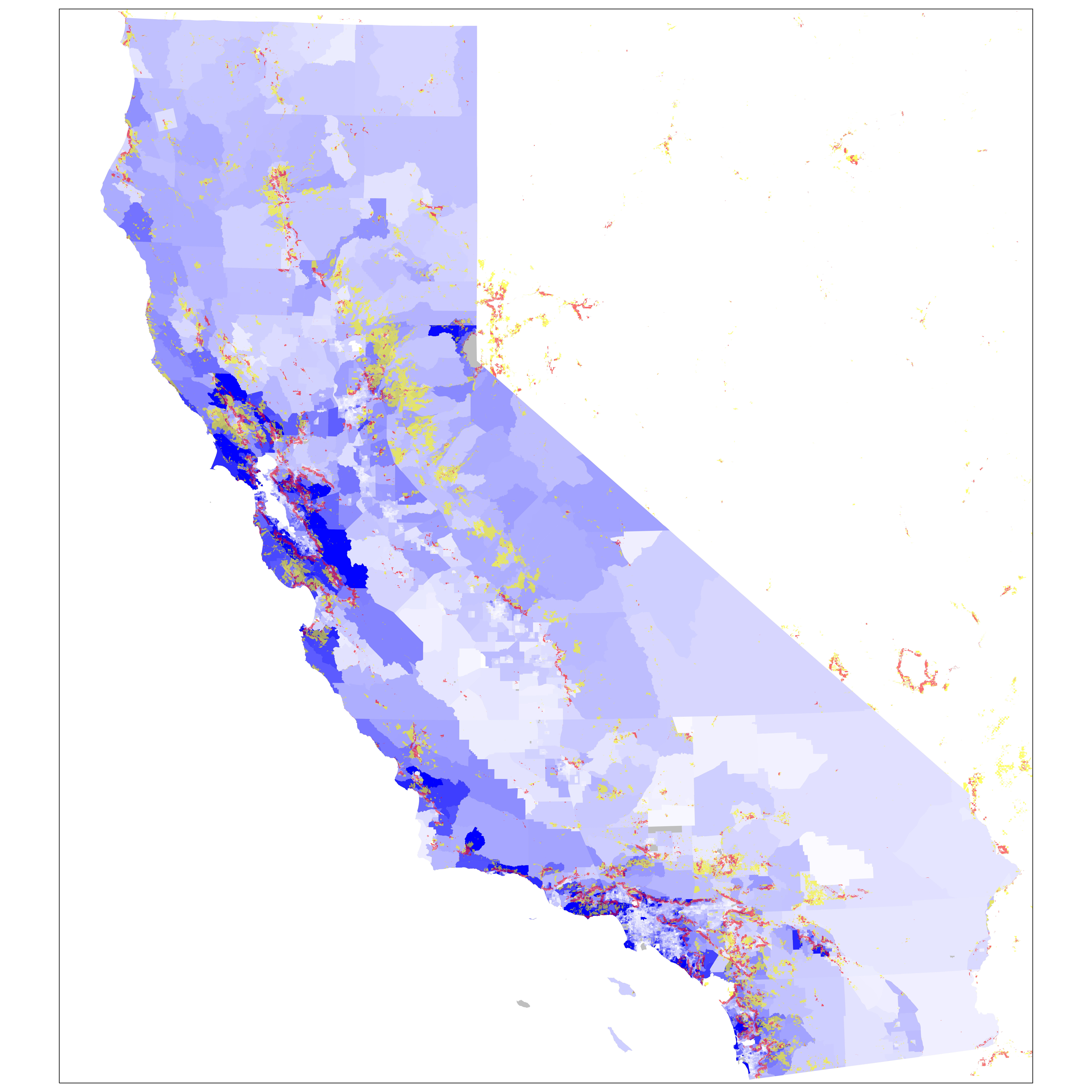
The wildland urban interfaces appear as rings around urban cores. (Las Vegas might want to get that checked out.) In the central and rural parts of the state, no correlation can be seen between the embodied real estate wealth and the wildland urban interface. But it is a different story in coastal Southern California.
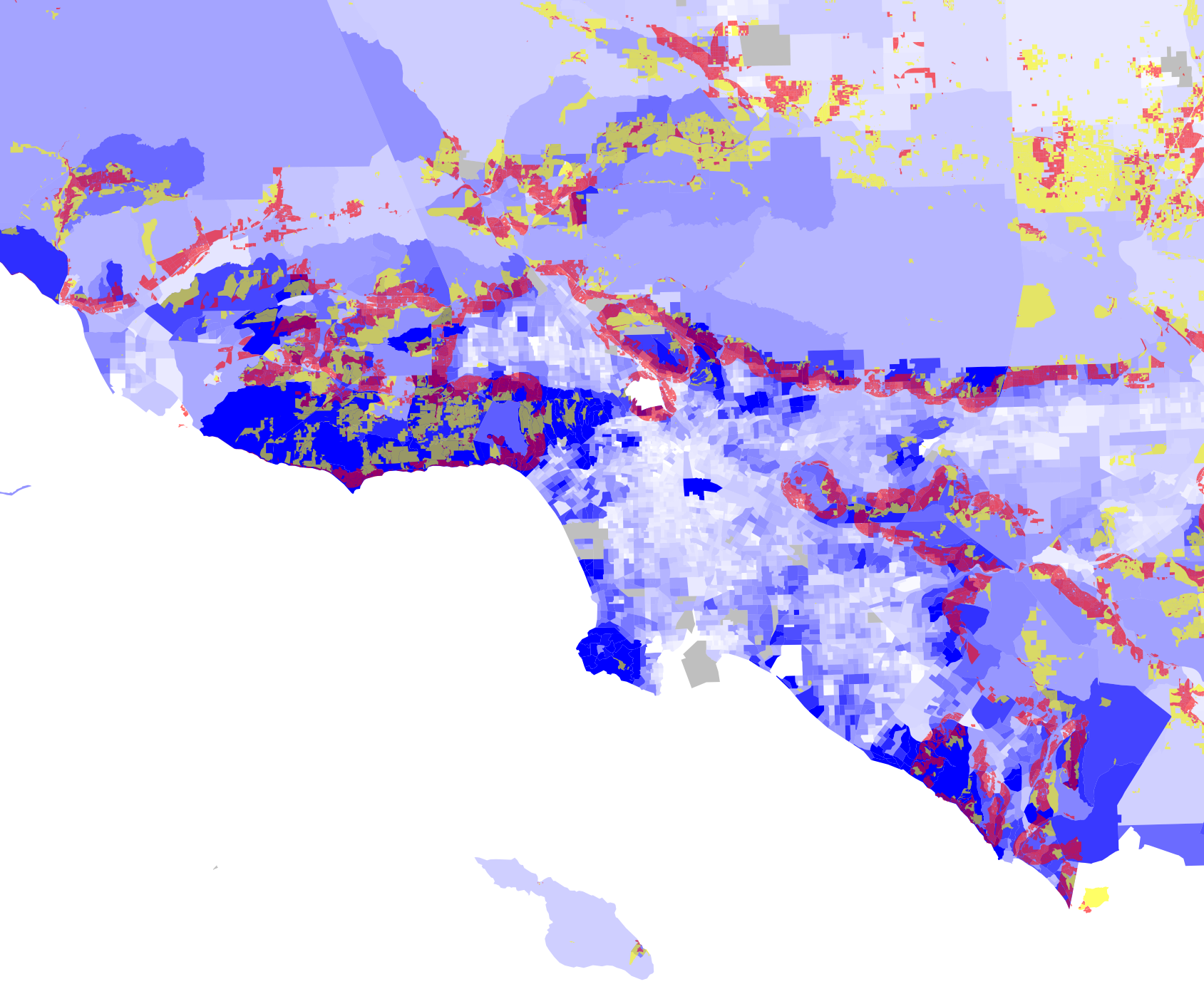
In the Los Angeles area, we see what I would expect. The hills surrounding the city are full of owner occupied, high value homes. This is also precisely where the greatest wildfire risk lies. The urban flatlands, while they may have high real estate value (and high income) in some places, also has low owner occupancy, so these areas show up light blue on the map.
This pattern does not hold true everywhere in California. Many rural and suburban areas, for example, on the eastern outskirts of Sacramento, are both low-wealth and at risk. But it tracks for hillsides surrounding Los Angeles and the Bay Area.
None of this is intended to discount the tragedy of wildfires for communities, families, and individuals, or that those impacted are not in need of assistance. Wildfires are a devastating natural disaster that impact all slices of society. And, like all disasters, the people most economically vulnerable before the disaster have the hardest time recovering.
Still, on average, wildfires disproportionately impact the property of the wealthiest. Maybe that’s why they have had such extensive media coverage in comparison to other consequences of climate change?