24 hours of the J-Church and N-Judah
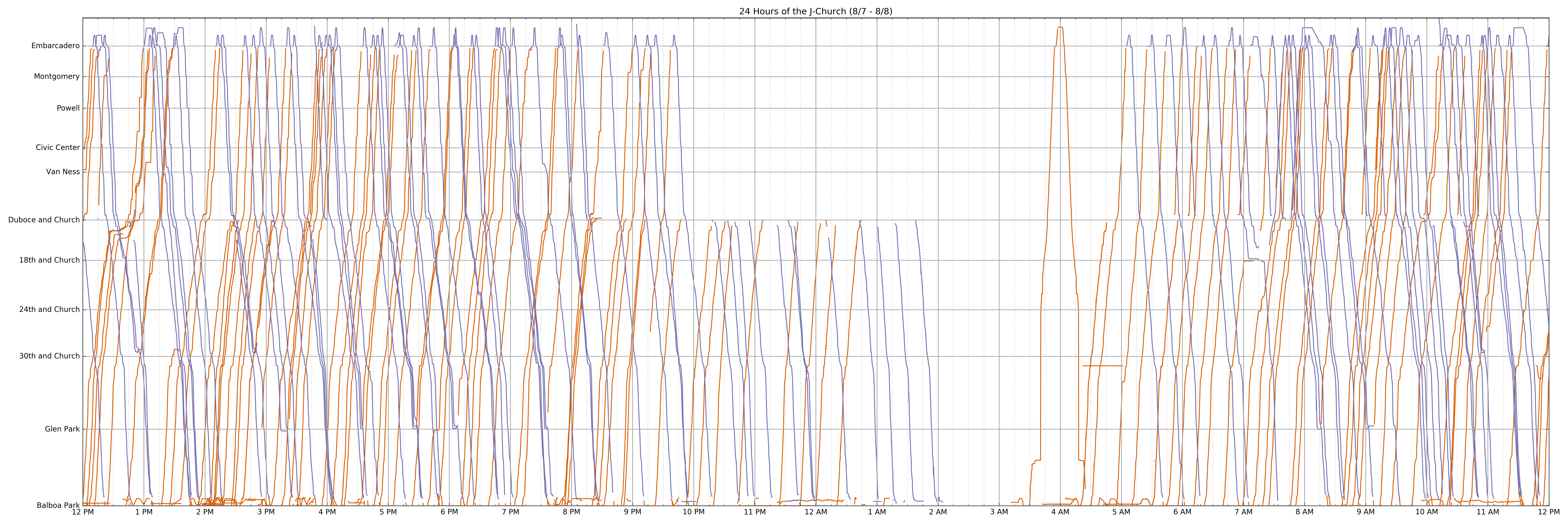
Using San Francisco Muni’s NextBus API, I collected a day’s worth of data on the movements of light rail vehicles and made a Marey style diagram of their movements. Click on each image for a full-resolution version.
This diagram style illustrates some daily grievances nicely. For example, bunching is shown by tightly spaced lines, and service gaps show up as long horizontal distances between adjacent lines.

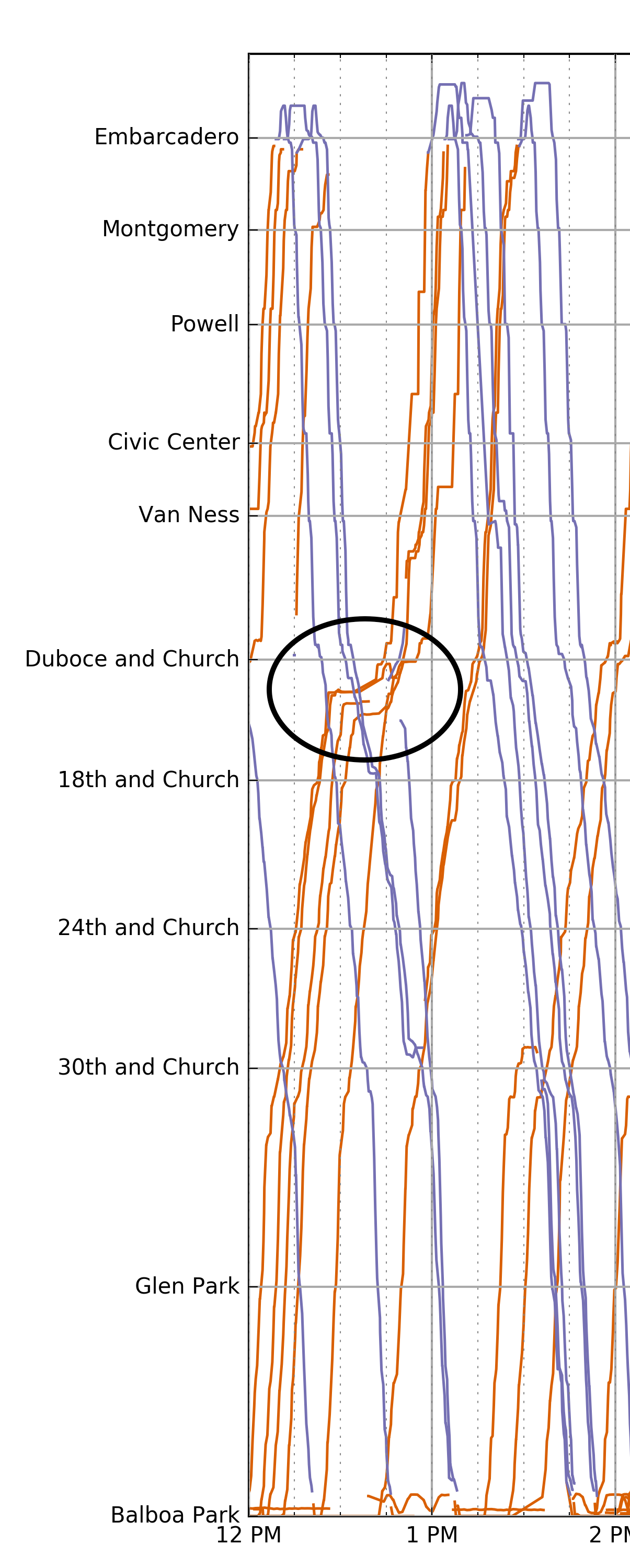
Both the J and the N must enter the Muni subway tunnel at the Duboce portal. Because of train congestion in the subway (caused, for example, by bunching) long delays are a common frustration here. These delays can be seen quite easily as horizontal lines where the train does not move. For example, around 12:30 several trains were delayed for 15 minutes.


