Sunshine maps, revisited
I’ve always thought these sunshine maps were a little suspicious.
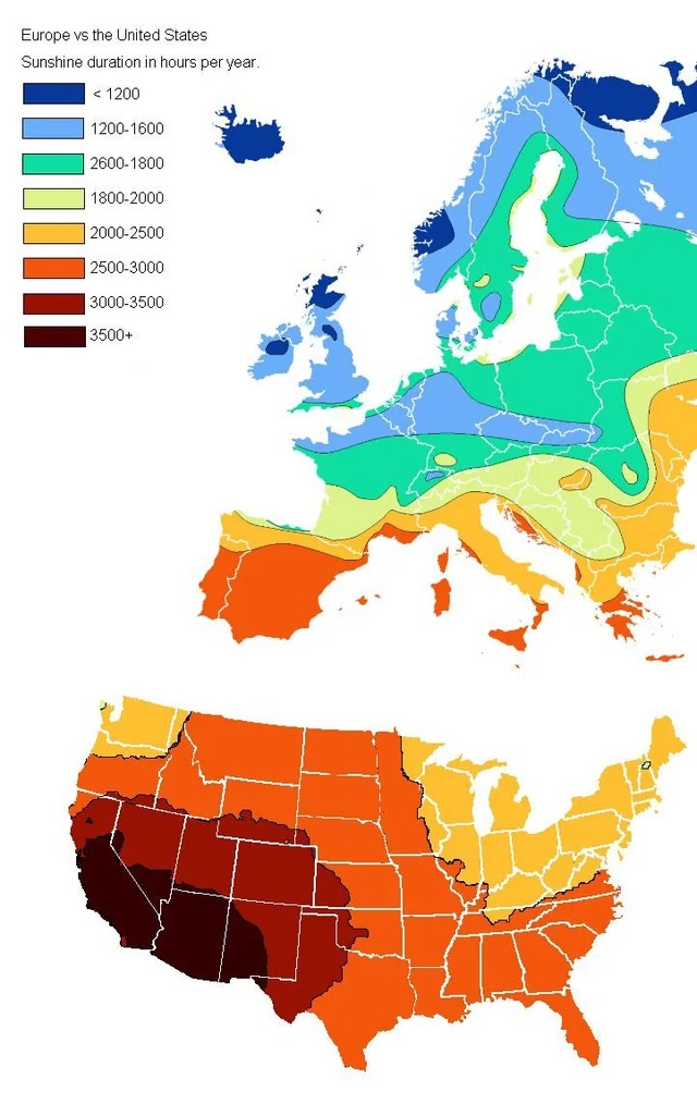
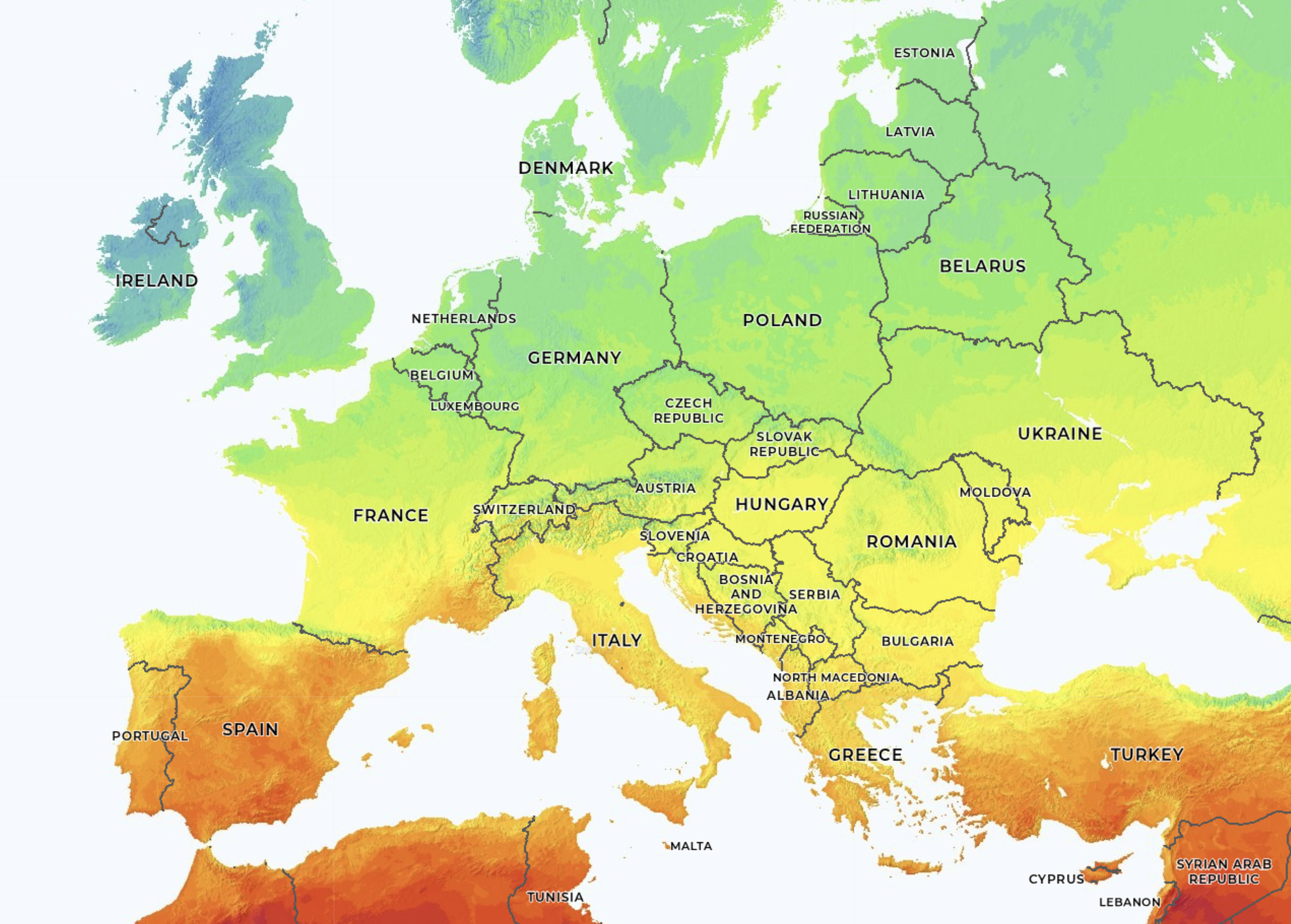
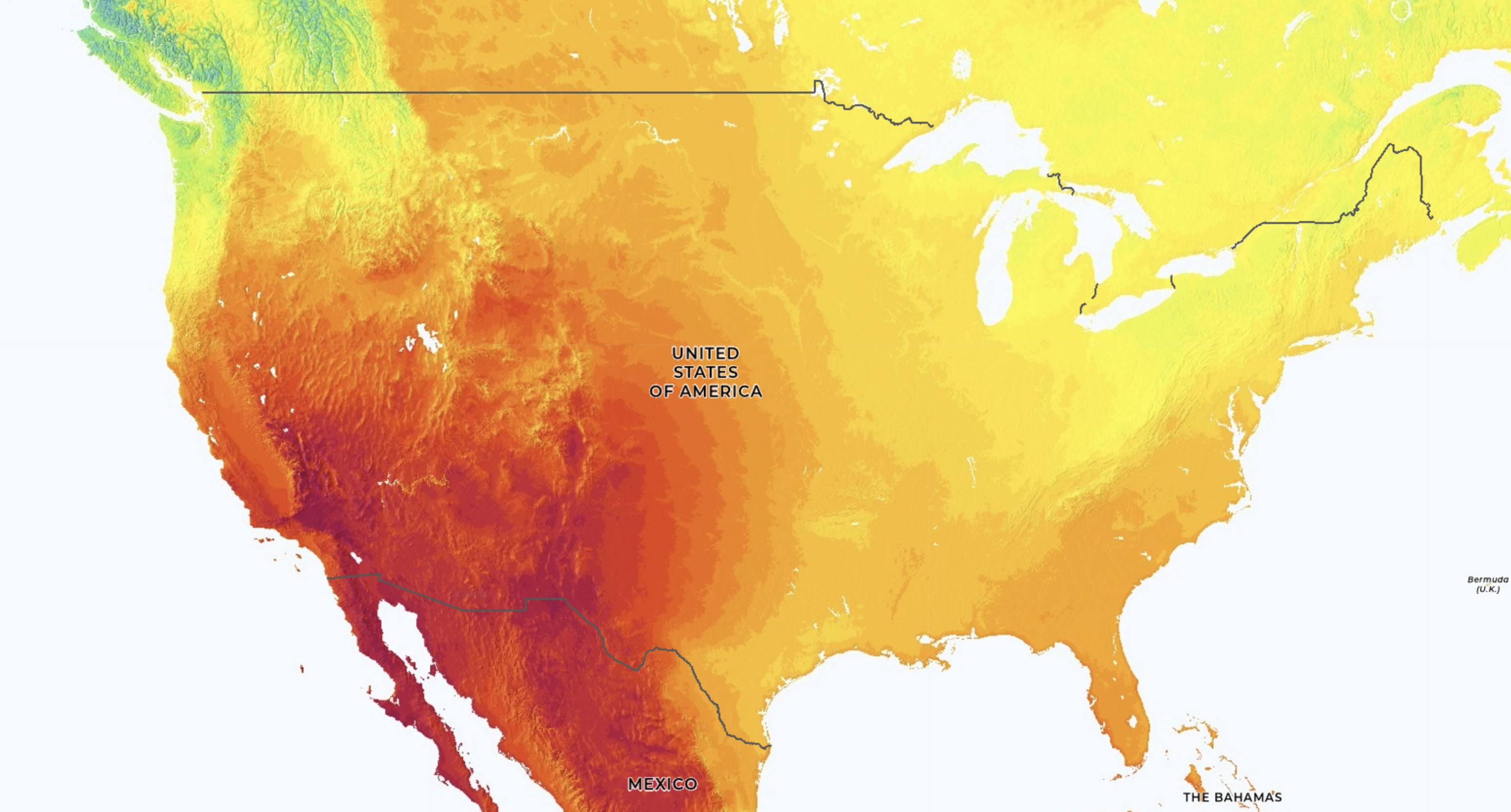
Not just the JPEG artifacts, but is Ohio really that much sunnier than France? Britain is dreary, but is it so dreary that Estonia is brighter?
Maybe it was the gloomy weather in Amsterdam but for some reason I tried to recreate this map the other day. A few hours messing around with a dataset from the World Metereological Organization answered many of these questions.
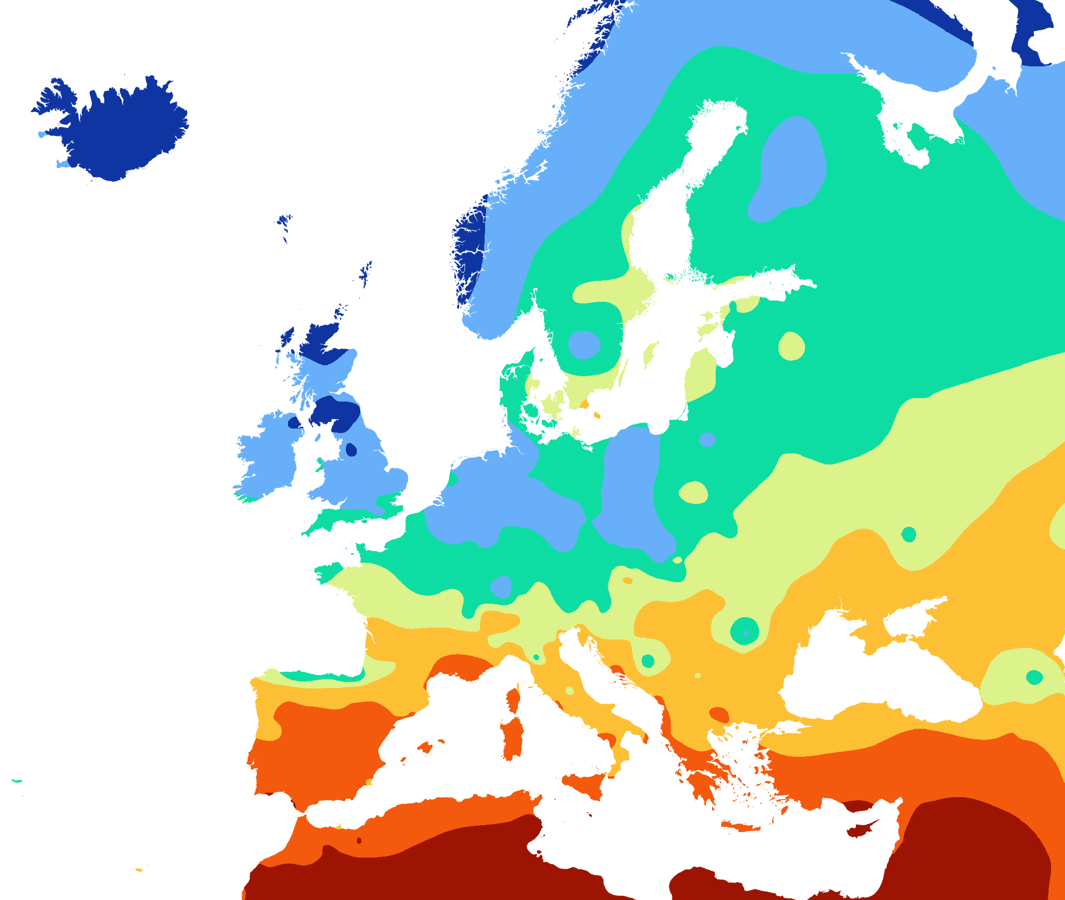
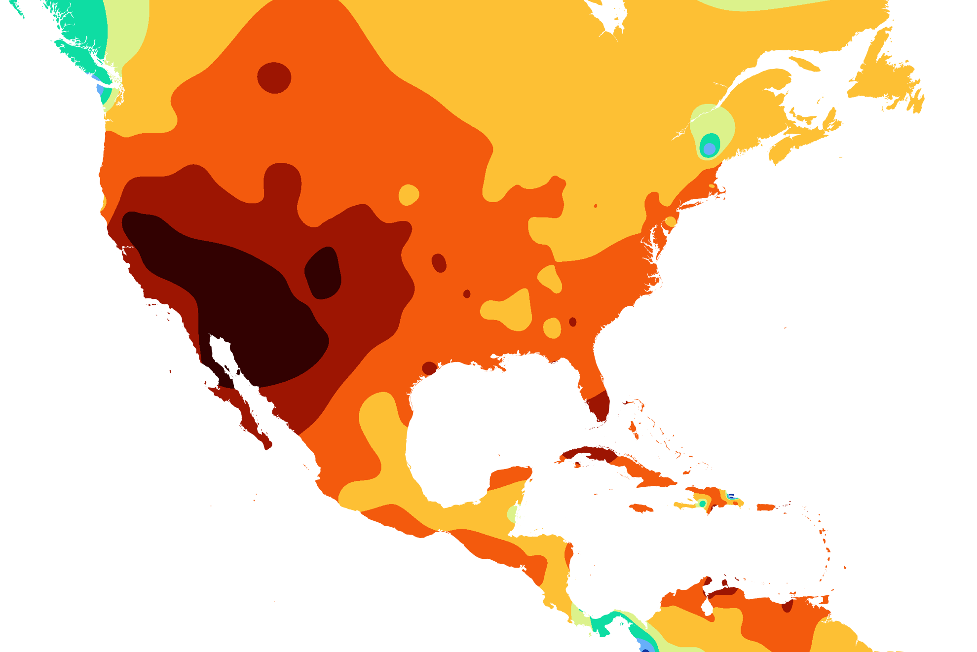
Is the huge difference between the US and Europe real? Oh yes. Europe is not very sunny. Thermal clouds form less often over water than land, partially explaining the Baltic brightness.
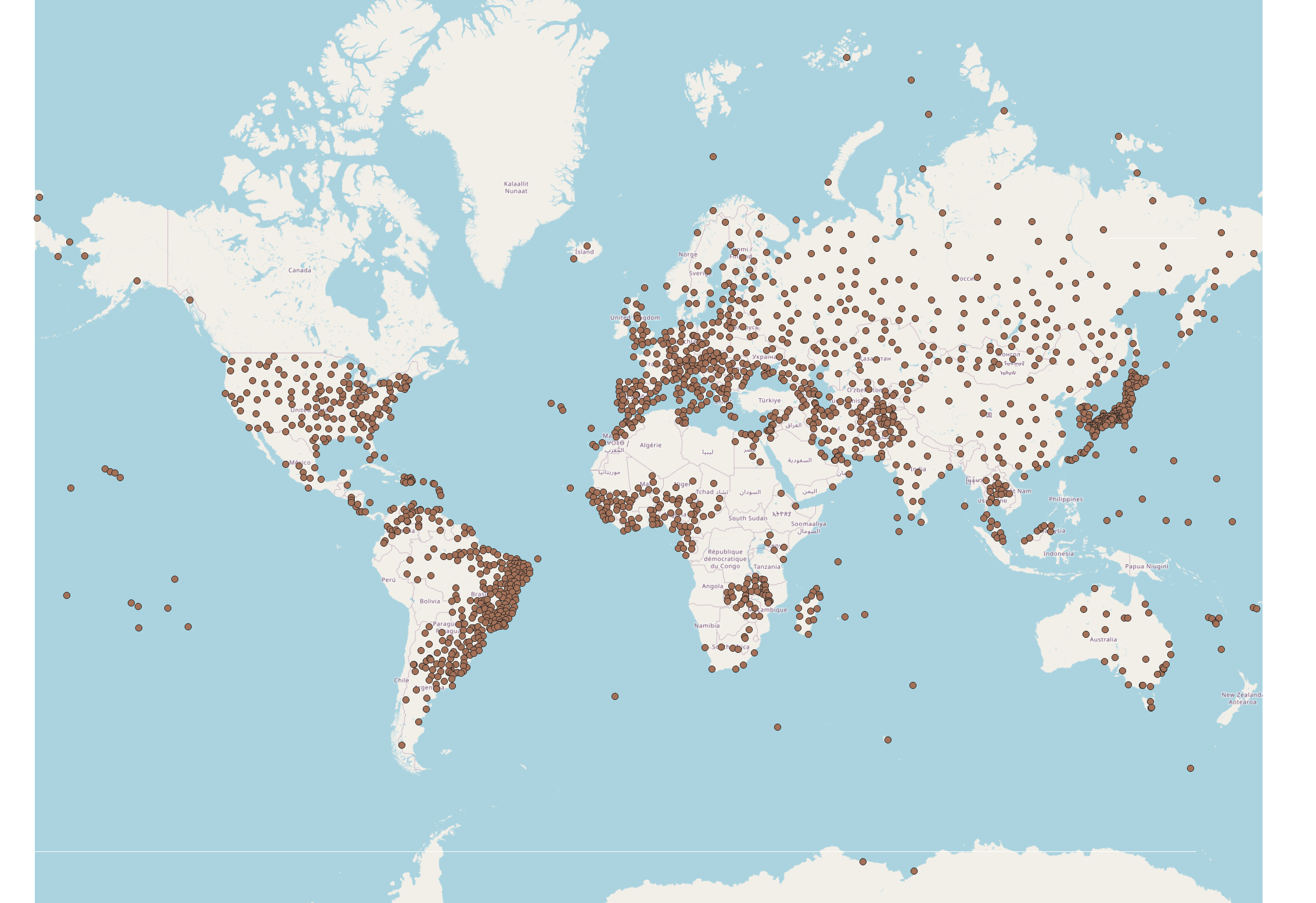
There are many data choices that affect the output. WMO dataset is inconsistently distributed. Europe is fairly evenly sampled, however there isn’t a single station in Turkey with data. Depending on the interpolation algorithm that you use to generate the raster, cities can generate pockmarks that don’t seem logical with the local topography.
While the map on Wikimedia does not provide detailed information about the data source (citing only “national data”), I suspect that the WMO dataset shares many properties of the data used for the original maps.
This makes particularly absurd maps when applied to the entire globe.
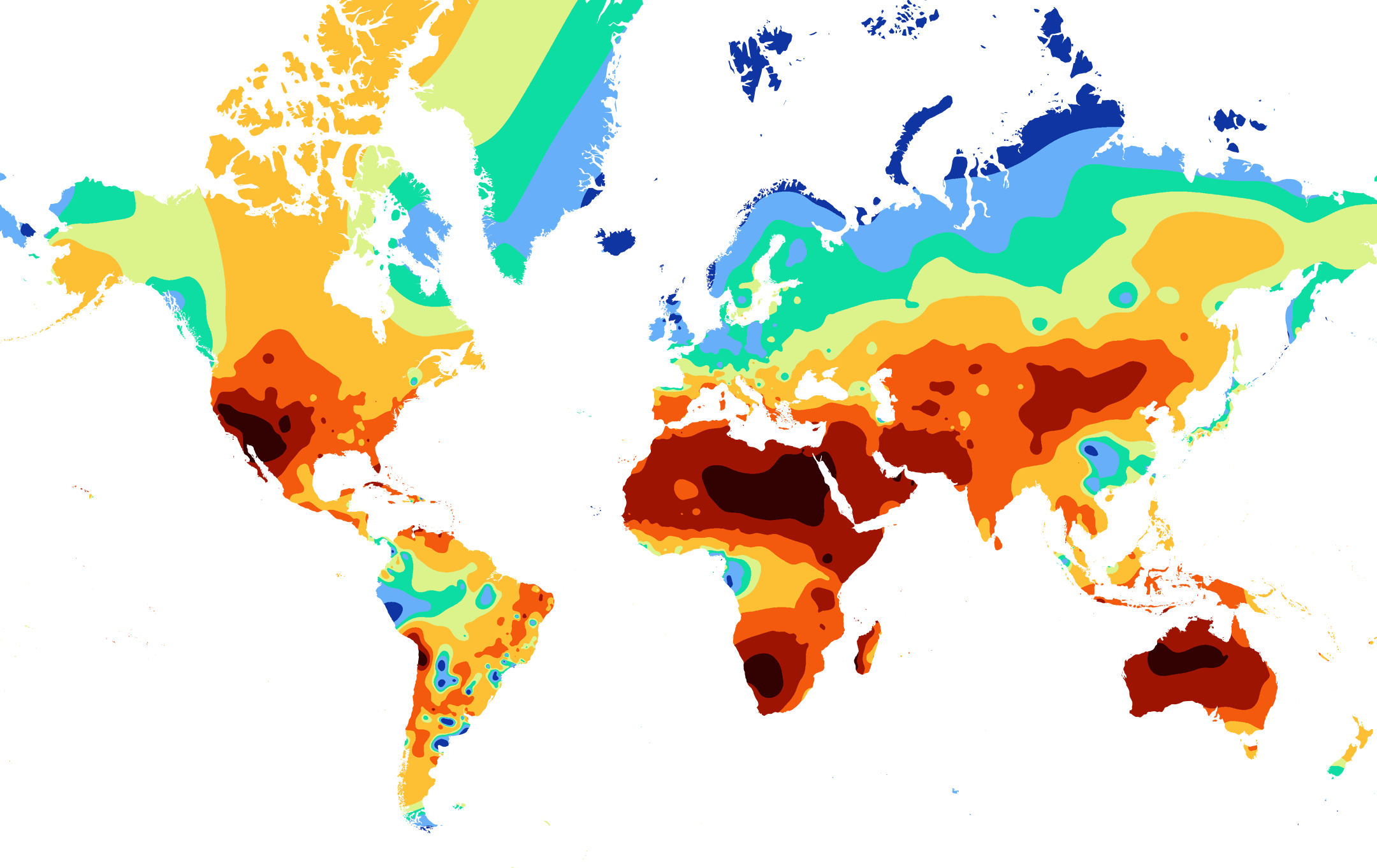
A better representation of this data is to look at solar power irradiance maps, like those from Global Solar Atlas which estimate the amount of power available for solar cells. This is different from sunshine hours in that it depends on the intensity of the radiation, so it emphasizes equatorial regions more than a map of sunshine hours.
By the way, check this out if SAGA’s B-spline interpolation fails with “the following layers were not correctly generated.”